Dinkie Thinking
It’s been an encouraging two weeks. I wrote the first chapter for a story I’m writing for my nanna (more on her later), completed a 2-day fast, and got some really great mid-week poker study done, which translated to great weekend performance at the tables
Here are my thoughts on the pens that saw me through…
Conway Stewart Dinkie
Specifications:
- Filling System: Leverfill
- Nib: Oblique
- Nib material: Gold
- Price Range: Depends…
- Ink: Robert Oster Grun-Schwartz
I’m sure it goes without saying, but I love my nanna. She looked after me a lot as a kid, when my parents would be at work (the days before WFH.. shudder), and my earliest memories probably are with her.
I remember one day in 2014 when I went to visit her. I was now much bigger than when she looked after me as a kid, and her house was much smaller (as she had moved just down the road to a bungalow a few years before).
I think she was the same size, though.
We were sat in her lounge, the windows open with the summer breeze tip-toeing in and out like a nervous kid, having a cup of tea and reminiscing about watching Fox and the Hounds and my love for her ham sandwiches made with home-made “seedy bread”.
Chat then turned to when she was a kid and, I guess as my birthday was approaching, she told me that as a child her favourite gift was a fountain pen
I remember this conversation for two reasons. The first is because she pronounced it as “fount-ayn”
The second reason is because at the time, I thought:
“A fountain pen? No matter how fancy you pronounce it, you can’t convince me that’s a better gift than a new PlayStation.”
Fast forward a year, and I’ve dived straight down the fountain pen rabbit hole. Nanna must have gotten a whiff of this, because for my birthday, she got me the same pen that she received when she was young.
It was that moment I realised just how a fountain pen is indeed a better gift than a new PlayStation.
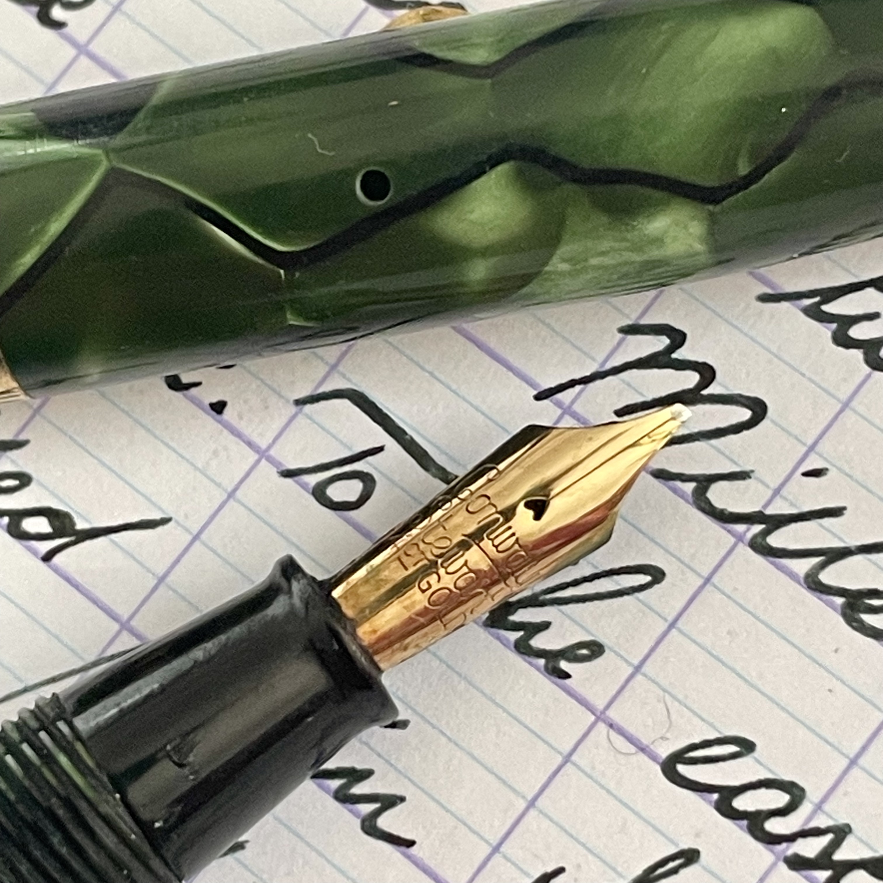
That pen is the Conway Stewart 550, affectionately nicknamed “Dinkie”. Although, I think that this is one of those cases where the nickname has pretty much become the standard.
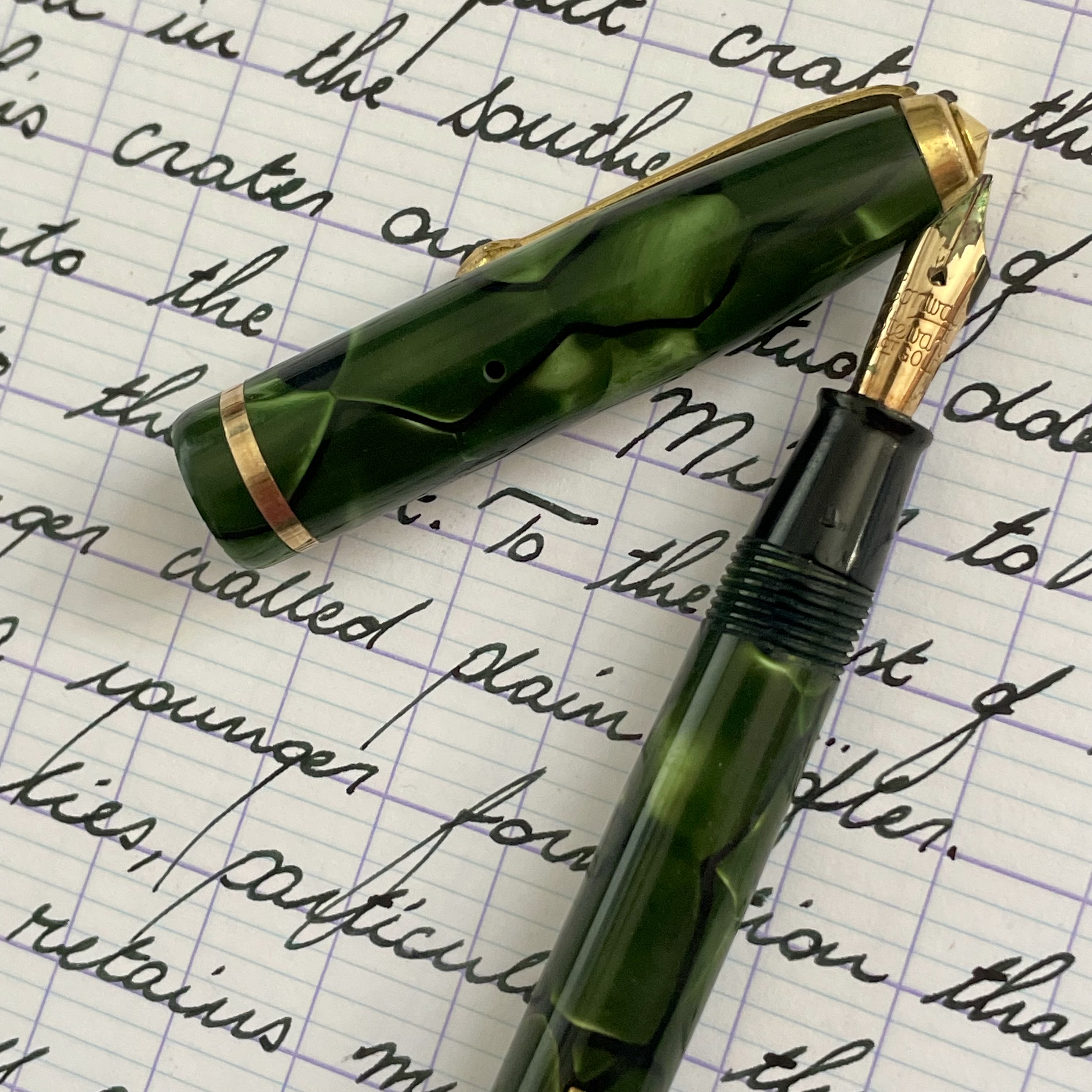
The lineup of pens that would eventually become the Dinkie was first released in 1922 made of vulcanite in a chased black design and without a model number (as was common for pens at the time) and proved to be a major success for Conway Stewart, with the models remaining in production for the next 50 years.
In case the name wasn’t a dead giveaway, the Dinkie is, er, pretty dinkie (Bri’sh slang for small).
In fact, it was advertised as the smallest practical fountain pen ever made. I think they needed the caveat of practicality, as Waterman lays claim to the smallest fountain pen, with their No. 000
(I’m not sure if it was mandatory in pocket pen nomenclature during this time that they have nicknames, but the No. 000 is also known as the doll pen)
There is no doubt that it’s tiny, but is it practical?
Of course, this is a pen that you need to use posted. Even when posted it’s rather dainty, especially when considering there’s not much girth to the pen either, so it feels a little bit like you’re writing with a twig.
I’ve been told that size doesn’t matter and that’s the case with the Dinkie because it’s a comfortable twig to write with.
Though a rare occurrence, I’ve found sometimes that if you form a letter at just the wrong angle the cap can come slightly loose from the posting. It kinda wiggles itself off by being pushed up from the crevice of your hand where the pen rests (or at least the way I hold pens).
I enjoy writing with this a lot. The 14 carat gold nib is stubby, even a bit oblique, and the filling mechanism works perfectly even after all these years. I’ve not had to repair this (thankfully), although I have managed to flip the lever once and I’m surprised that didn’t break the ink sac.
I’ve got it inked up with Robert Oster Grun Schwartz. The nib is wet, so not much of the grun comes through, but after writing for a while you can see some of it peak its head.
I was sure to clean this out immediately however, as I’ve heard that Robert Oster inks can be a bit alkaline and aren’t particularly well-suited for vintage sacs.
Not sure how true this is, but I’m not willing to find out.
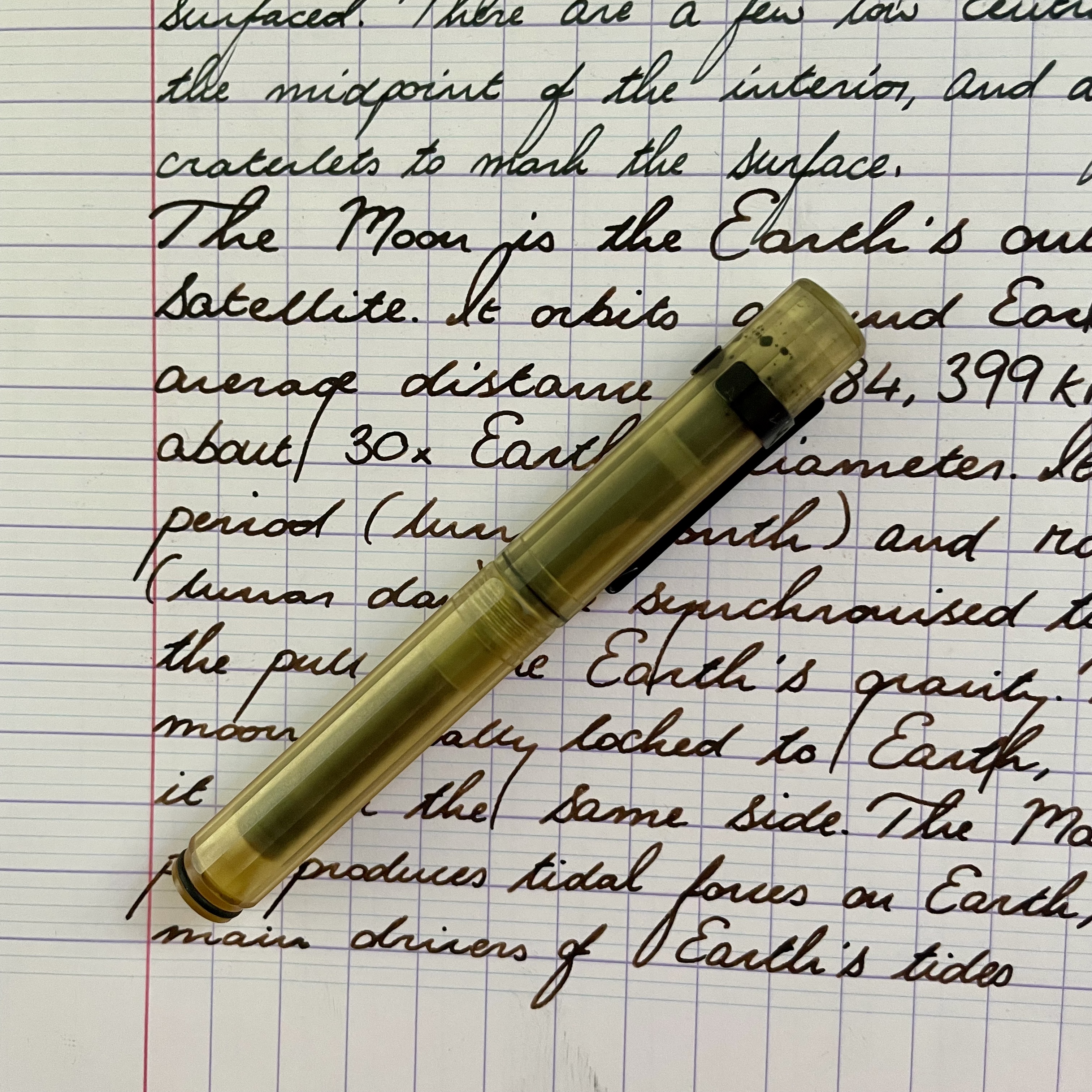
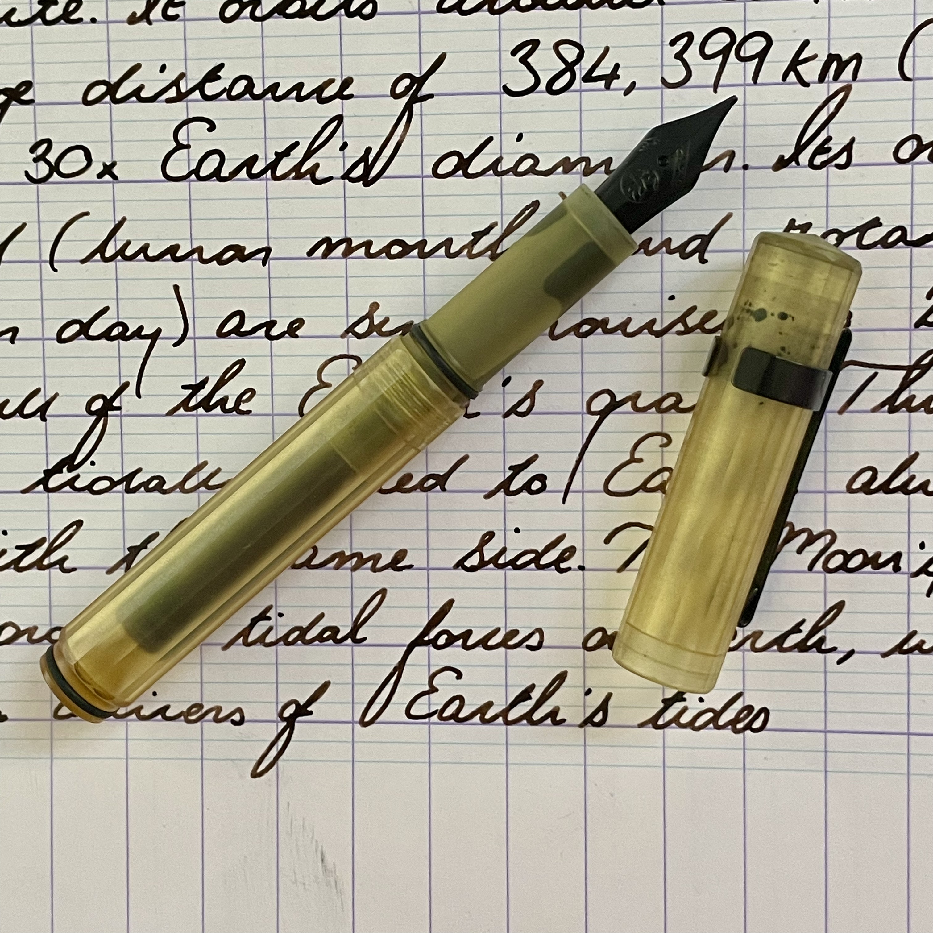
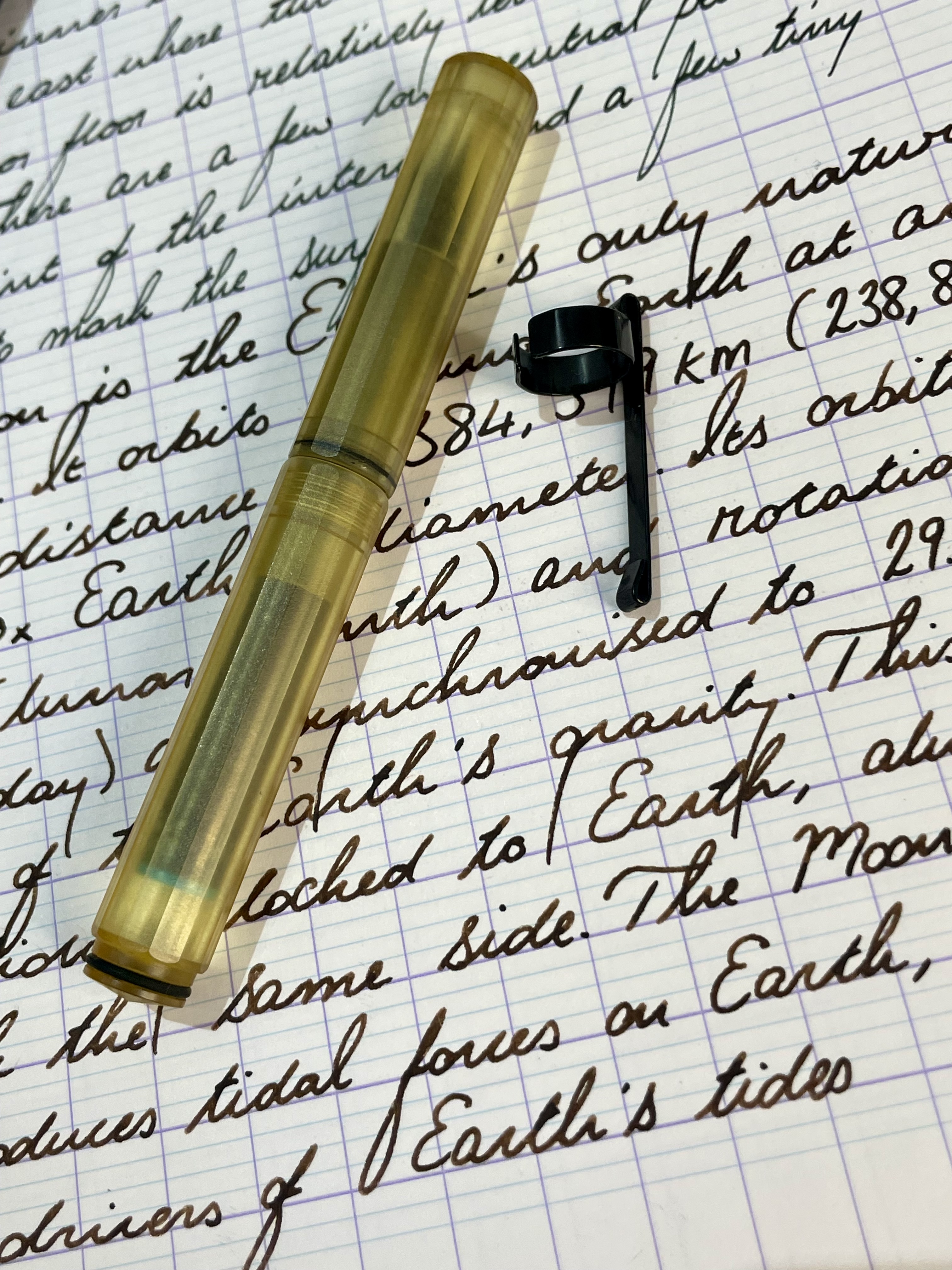
Wingsung 618
Specifications:
- Filling System: Piston
- Nib: Medium
- Nib material: Steel
- Price Range: £15
- Ink: Caran d’Ache Hypnotic Turquoise
From my most sentimental pen to one of my absolute favourite pens.
The Wingsung 618 takes design from Parker and Sailor. The clip is undoubtedly Parker and the hooded nib naturally invites comparison to the Parker 51. Meanwhile, the cap band is basically a Sailor one that reads Wingsung on it.
I don’t hold much opinion on this sort of stuff. Call me a hedonist, but my main concern is if I enjoy using it
…and I really do!
The 618 has an alluring torpedo shape, the full-demo nature is really awesome and kinda unique for a hooded nib pen (afaik). The Hypnotic Turquoise is mesmerising (or, dare I say, hypnotic) to watch slosh around in the transparent barrel and it’s like carrying around a crystal blue ocean that happens to write.
It’s a pen that makes writing feel special, without being precious about it. The hooded nib lays down a perfectly consistent line and the large ink capacity makes it a pen great for those longer writing sessions.
My only gripe with this is sometimes the hooded section will twist when you uncap the pen, so you need to turn it back before writing. Some have resorted to using shellac to keep it in place. Others (me) are just lazy and pay the rotation tax.
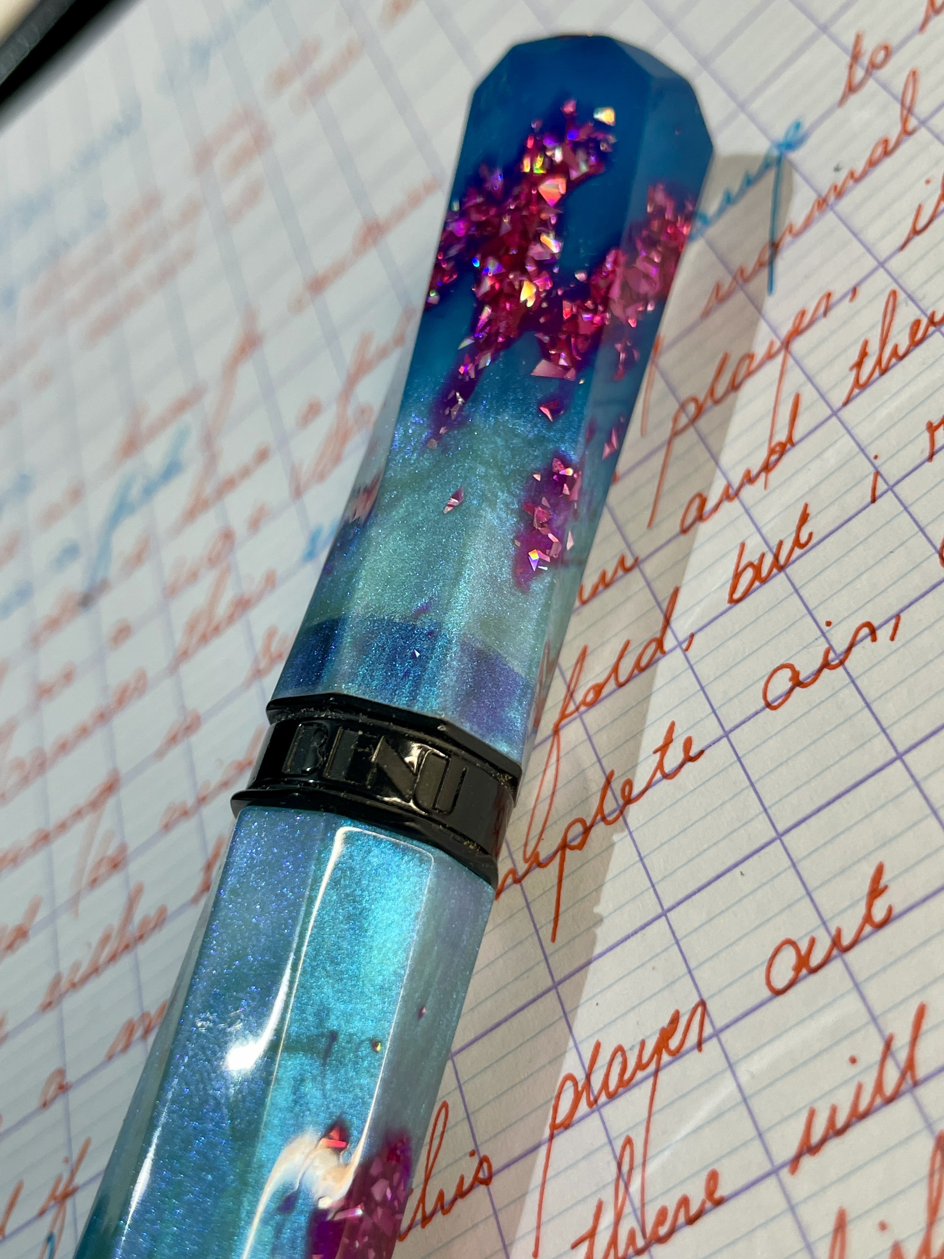
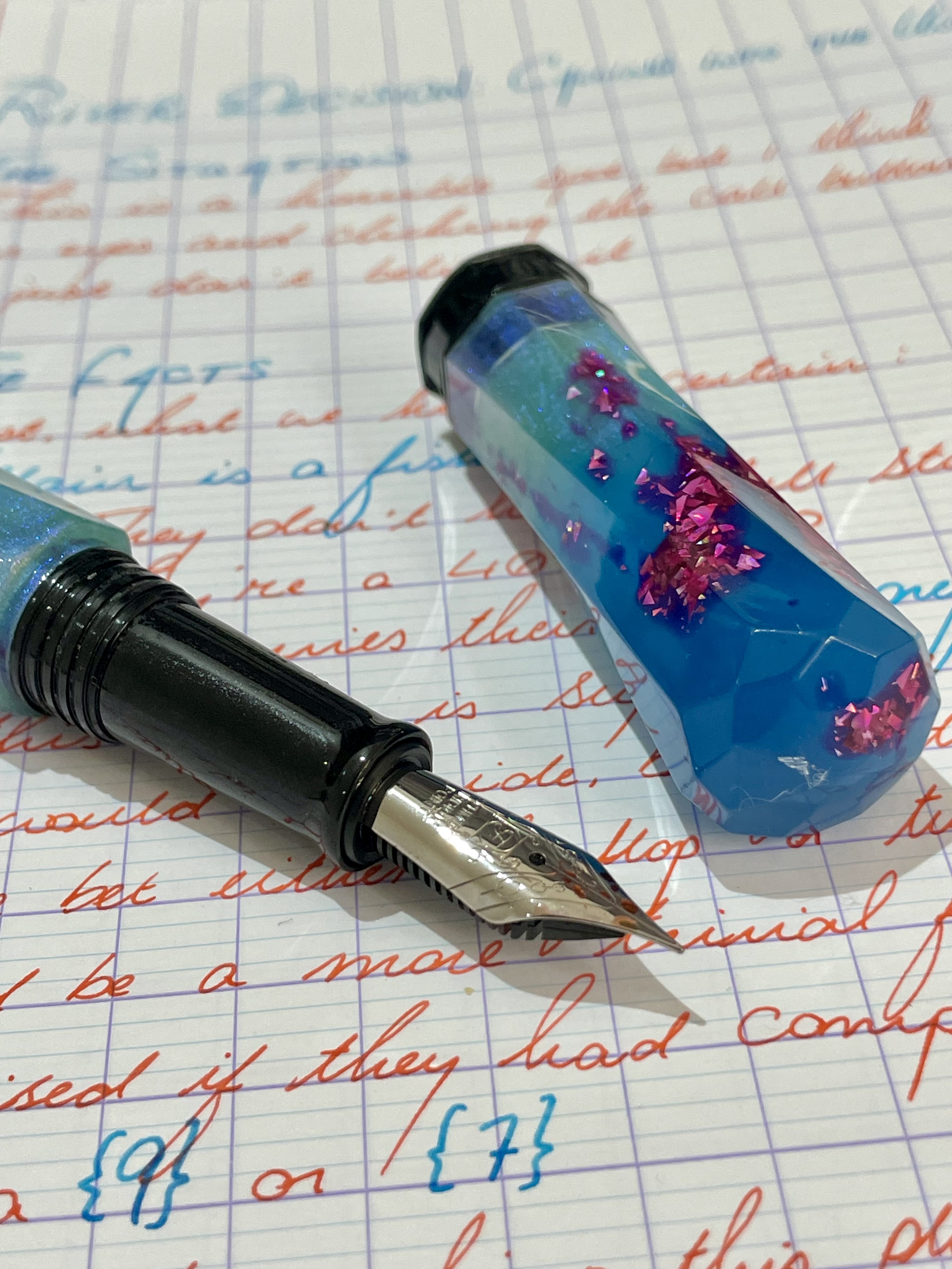
Benu Grand Sceptre
Specifications:
- Filling System: Standard international cartridge/converter
- Nib: Fine (Schmidt)
- Nib material: Steel
- Price Range: £100
- Ink: Noodler’s Dragon’s Napalm
From understated to overdressed. If the Wingsung 618 is a shy pen, the Benu Grand Sceptre is a pen that runs up to your face and shouts
I GLOW IN THE DARK!!!
Not that you wouldn’t spot this pen a mile away if it were to run up to you (even in the dark, apparently)
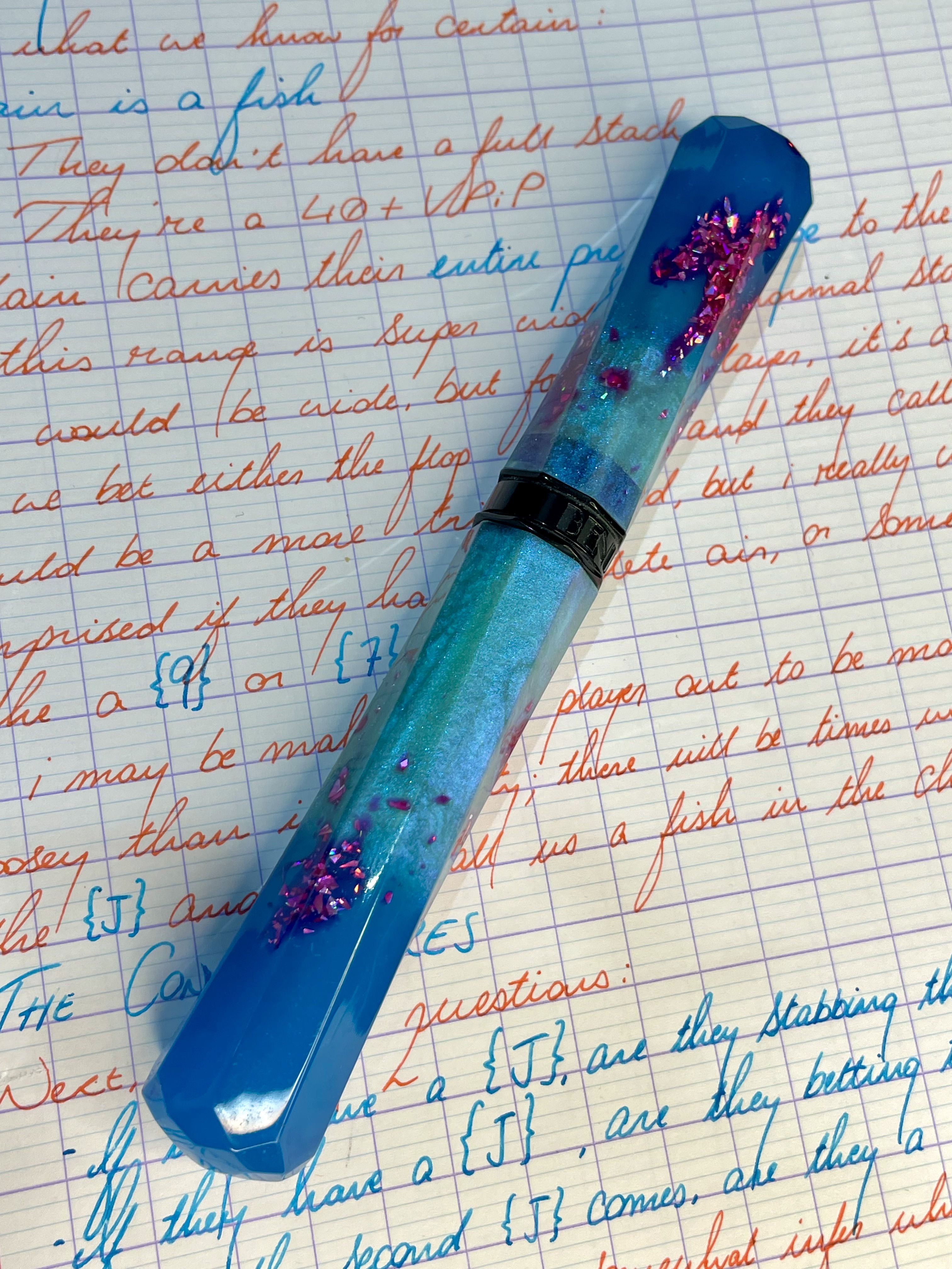
Blue, pink, sparkly, glittery. Love it. If I was to design a pen, I don’t think it would be too dissimilar to this Benu.
Looking like a miniature sceptre, it has a really unique shape, which helps make the colour pop even more. This isn’t a pen that’s going to get lost amongst your desk
…and if it does, well, I’d sure love to see what your desk looks like.
A pen like this requires a fitting ink; I wasn’t going to put Diamine Jet Black in it. Nope, it needs something that screams, while the body shouts.
Noodler’s Dragon’s Napalm seemed fitting enough, in both shade and name. A fiery ink for my sceptre that would make even the most noble of dragon slayers proud.
St. George who?
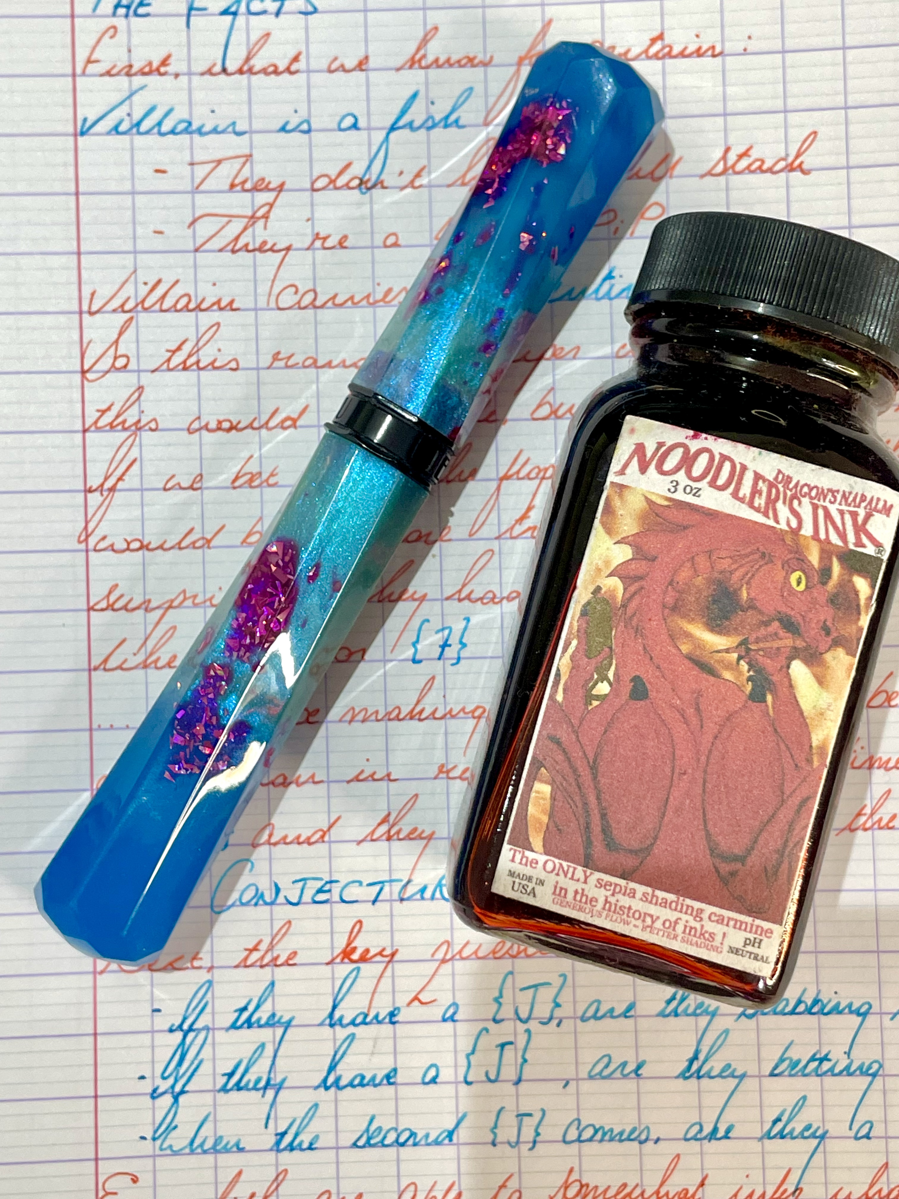
I found myself using this pen a lot with the Wingsung 618, as the muted orange-pink popped really well with the hypnotic turquoise ink.
Ensso Minimalist XS
Specifications:
- Filling System: Small international cartridges
- Nib: Medium
- Nib material: Steel (black coating)
- Price Range:
- Ink: Kaweco Brown
The fourth pen, the Ensso Minimalist XS that I have been using lately is the newest in my collection. Interestingly enough, I seemed to pair this a lot with the Conway Stewart, which is amongst the oldest (both by release and acquisition date) in my pen arsenal.
They are (alongside the Kaweco Liliput also the smallest that I own.
.jpeg)
.jpeg)
While I enjoyed using the Wingsung/Benu together for their colour coordination, the Ensso and Conway Stewart appeared more similar than different, and it was this that made me so keen to pair them.
The dark inks work well side-by-side, and the two only told apart, really, by the slightly lighter (and less green) Kaweco ink and the line shapes, with the Conway Stewart being more italic due to the oblique nib.
Here’s a writing sample about a crater that is found on the Moon. I find it quite marvellous that there is an impact crater that not only can we photograph, but we’ve named and defined? Mad…
It only takes short international cartridges (I mean, duh) and it absolutely guzzles through ink as the nib is very wet, which makes the ink pool a bit darker in spots, but also leads to some lovely shading. When you look closer, you can see more of a difference in the colour.
When capped, the pen is even smaller than the Dinkie, although when you unsheath them they are the same size; the Ensso is the tiniest bit larger when posting.
The posting with the Ensso is a bit more reliable, however, as there is a seat for the cap to sit, as well as an O-ring to make sure it’s tight and your hand doesn’t wiggle it off.
Years of innovation, eh?
My absolute favourite thing about this pen is that it gives a pop sound when you remove the posting, which, I think, this is the true innovating feat by Ensso.
Ultem
This is my first (and only) ultem pen in my collection, though it’s a material I hear is all the rage in the hobby at the moment. I found it listed on eBay and thought I’d take a shot.
I’ve used a few Ensso pens in the past, but never permanently had one in my collection. Of the Ensso pens I have tried, they were only super heavy all-metal pens.
Time to flip the scales, I guess!
Ultem is a dirty yellow colour that feels like plastic; the black accents on this pen work well with the barrel colour. After writing the black cartridge dry that came with the pen, I put in a blue one in and just didn’t vibe with it. The next darkest colour I could find was brown, and that seemed to stick (until I wrote that dry, too - I told you it was a guzzler!)

This black coated nib and dehydrated-pee yellow barrel colour needs a dark ink, that’s for sure.
The pen is faceted, which is nice because it stops the pen rolling around on the desk. There is a clip that comes with the pen, should you be so inclined. But it’s nice to know that even without the clip, it’s still safe on your desk.
The clip perhaps looks a bit flimsy, but it’s surprisingly rigid. Thinking back to my GCSE physics, I would say that this clip is “brittle”, as I imagine that if you push it enough, it’s just going to snap rather than bend.
Just don’t do that, I guess, and you’ll be fine?
Zebra Sarasa Clip
Which leads me on to the non-fountain pen I’ve been using lately: A pen that isn’t just named for its clip, but engineered around it.
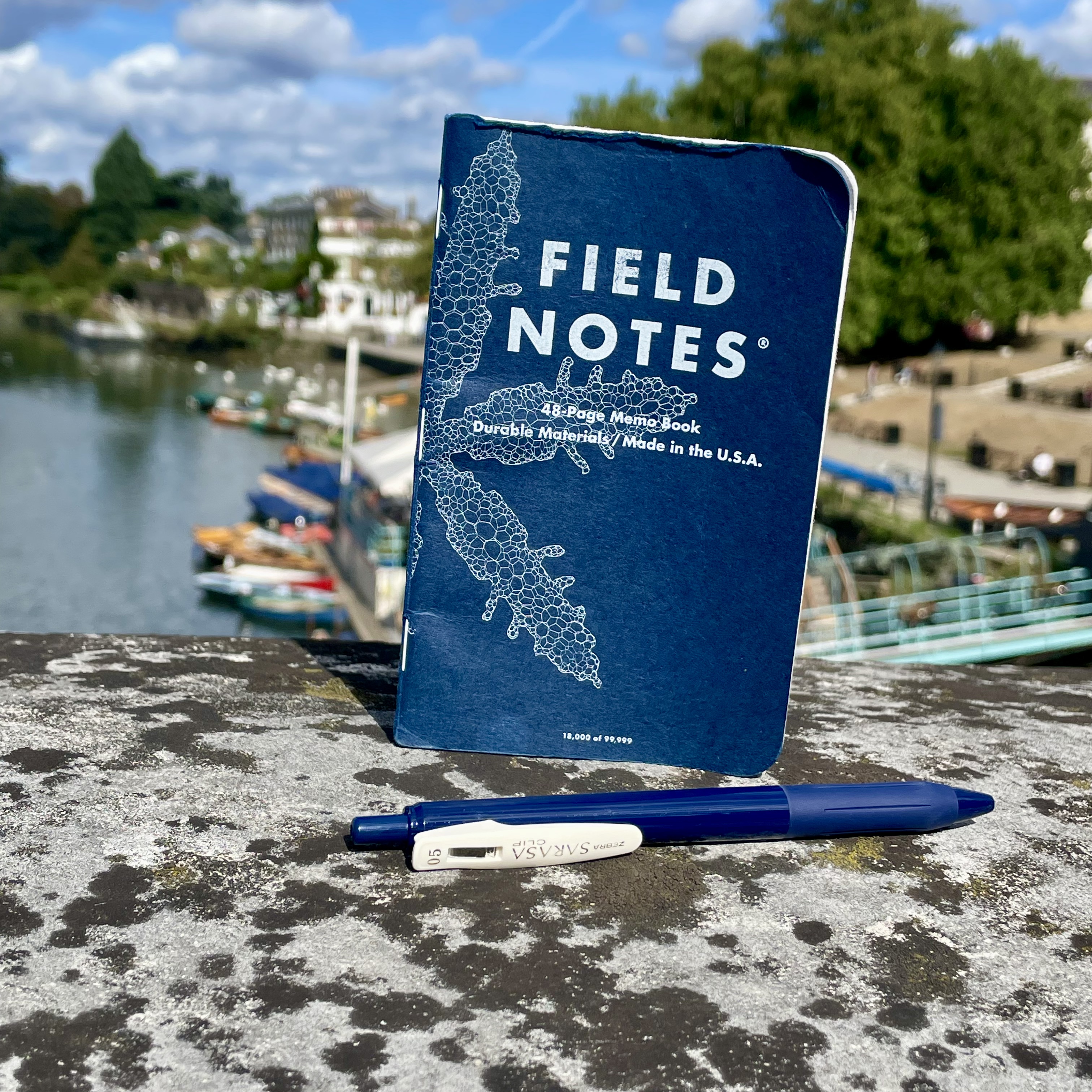
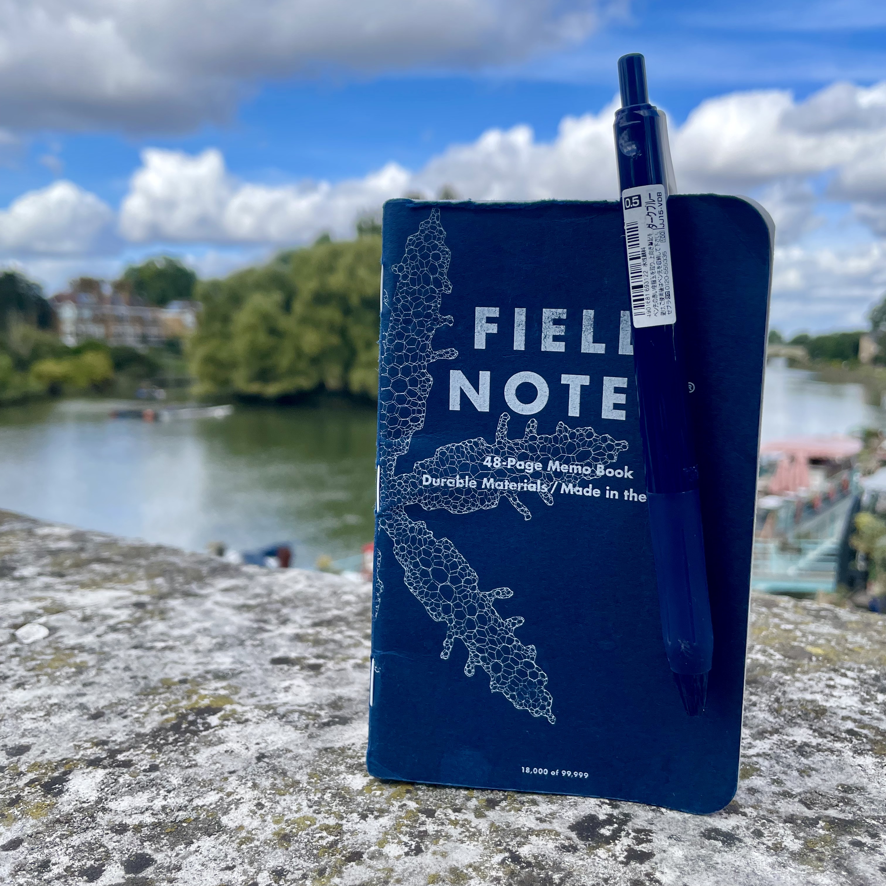
The spring-loaded wire clip of the Zebra Sarasa opens wide enough to swallow an entire pocket notebook, then clamps down with enough grip to survive my pocket acrobatics without leaving battle scars on the cover.
Contrast this to an earlier carry, the Jetstream Edge, which practically mauled my last notebook to the point where I had to use washi tape to keep the cover attached to the notebook (and sacrificed the back page in the process).
Usually I just slide the pen over the first few pages of the notebook, but the Sarasa Clip really is the king of portability and every pen I thus clip to my pocket notebook will be compared to it.
The navy barrel pairs perfectly with the colour of the Field Notes Snowy Evening (summer weather be damned!)
Conclusion
Looking back at these two weeks, each pen played its part in making them encouraging. The Dinkie reminded me why I started this journey, while the Wingsung and Benu tag-teamed through my poker study, their contrasting inks helping me visualise different concepts and remember key strategies that paid off at the weekend tables.
The tiny Ensso proved that good things come in small packages, making even giant lunar crater descriptions feel special, while the Zebra Sarasa was a perfectly pocketable companion.
…here’s to the next fortnight!
Cheers.