

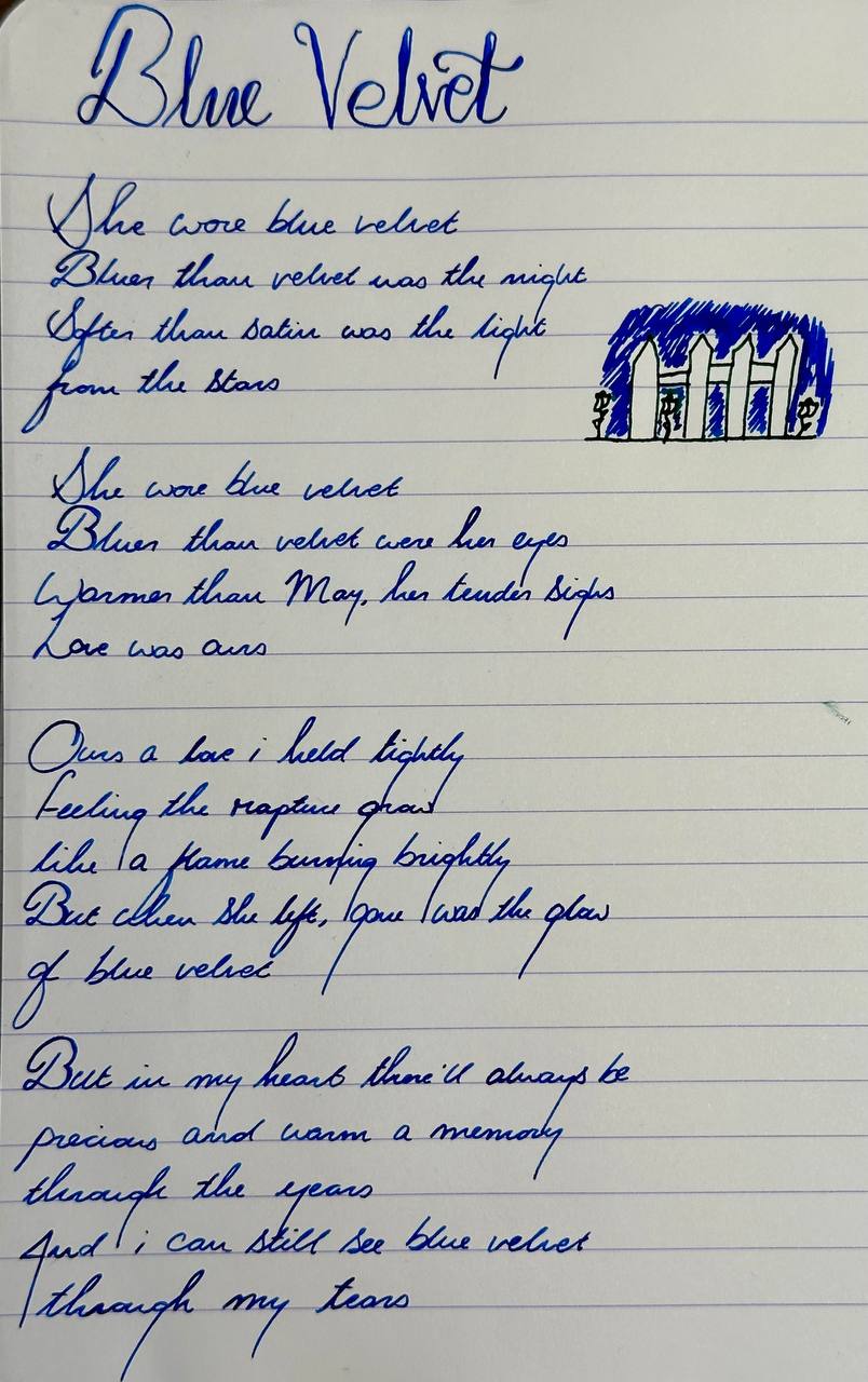
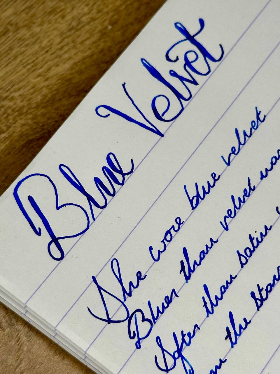
Blue Velvet
Every two weeks, I rotate four pens into my daily carry, and one of them inevitably demands to be written about rather than just written with
Something about it catches the light differently, or the ink does something unexpected, or I simply find myself reaching for it more than the others
When that happens, I pay attention
I have more pens than I do hands (significantly more) and I want to write about them. These aren’t reviews; more pensive thoughts, or inky thinkings
If you’re looking for nib measurements and posting lengths, you’ll want to look elsewhere.
If you want to know why a grown adult gets unreasonably excited about a specific blue ink, you’re in the right place
But first.. let me tell you about a film..
Now It’s Dark
I went to see Blue Velvet at the BFI (London, Waterloo) the Sunday before this current fortnight cycle kicked off
If you haven’t seen it, David Lynch’s 1986 masterpiece is the kind of film that settles into your subconscious and just stays there
Jeffrey Beaumont starts as the clean-cut boy next door and ends up somewhere else entirely; the Freudian undercurrents are handled with a deftness that most films fumble. It’s unsettling. It’s gorgeous. You walk out of the cinema and the world looks slightly different than it did two hours ago
When walking out of the cinema that night, I knew exactly what ink I wanted to have in the first fortnightly rotation of 2026
Yep - Diamine Blue Velvet
Blue is my favourite colour and this is hands down my favourite in all my ink collection. As it’s not in Diamine’s standard lineup (it’s in one of those weird triangular shaped 150th anniversary bottles), I feel that it sometimes flies under people’s radar
But I’m here to tell you: this is the best blue ink you will find on the market
The hue, the depth, the shading; everything sits exactly where it should be
Fight me.
Heineken? Fuck That!
As it’s my favourite colour, it’s unsurprising that my collection skews heavily in that direction
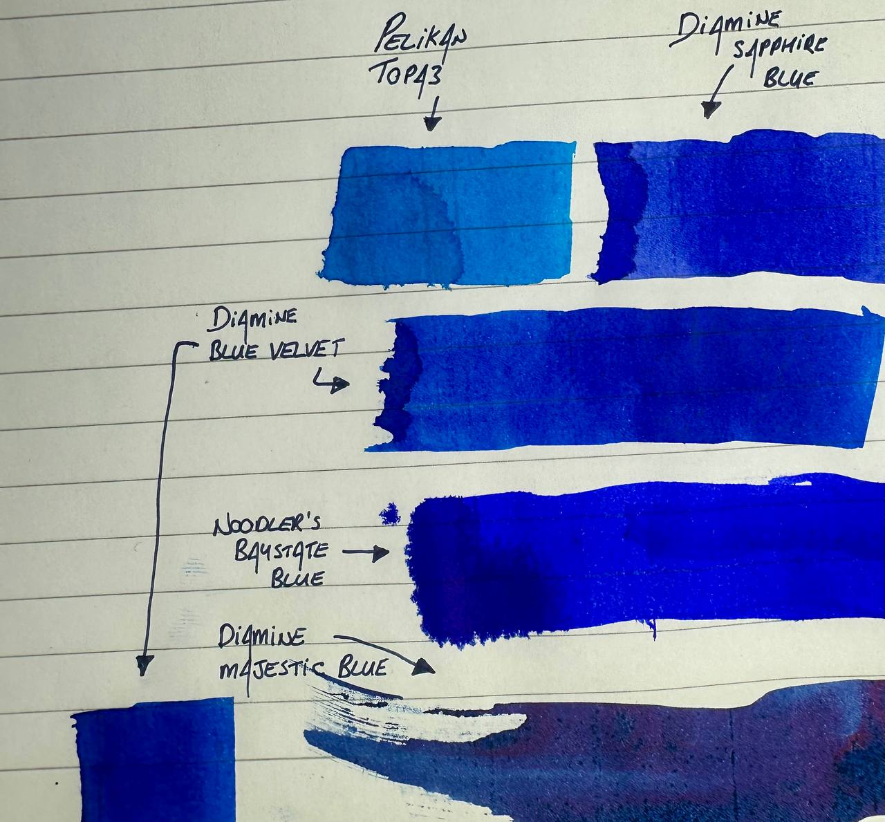
But Diamine Blue Velvet is the one - when placing others blue inks next to it, they either look too light/dark, too purple/green, or too washed out in comparison
If I’m Goldilocks, then this ink is just right
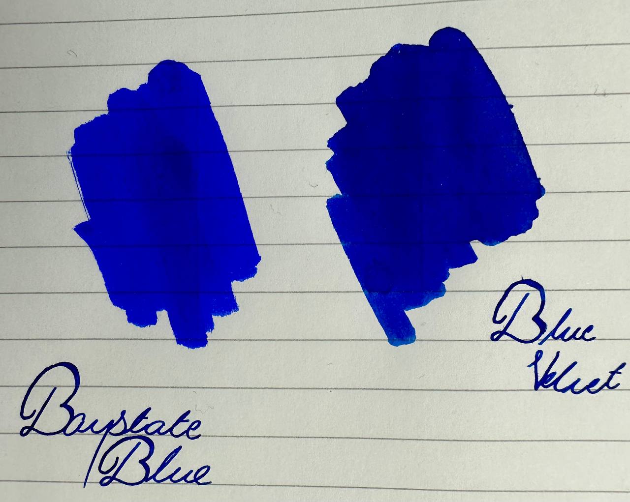
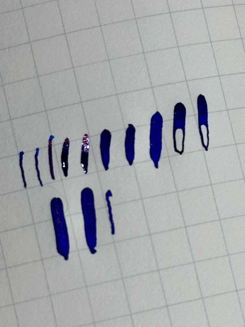
Here are some quick and dirty ink swatches I did to show this off. One might think of Baystate Blue as the ultimate blue, and I can get on board with the hype. But in comparison to Diamine’s Blue Velvet, it just doesn’t have that same depth, and it leans ever so slightly purple which, honestly, makes it look a bit washed up in comparison
So. I wanted to use my favourite blue ink..
..which meant I needed a suitable pen to house it
In Dreams
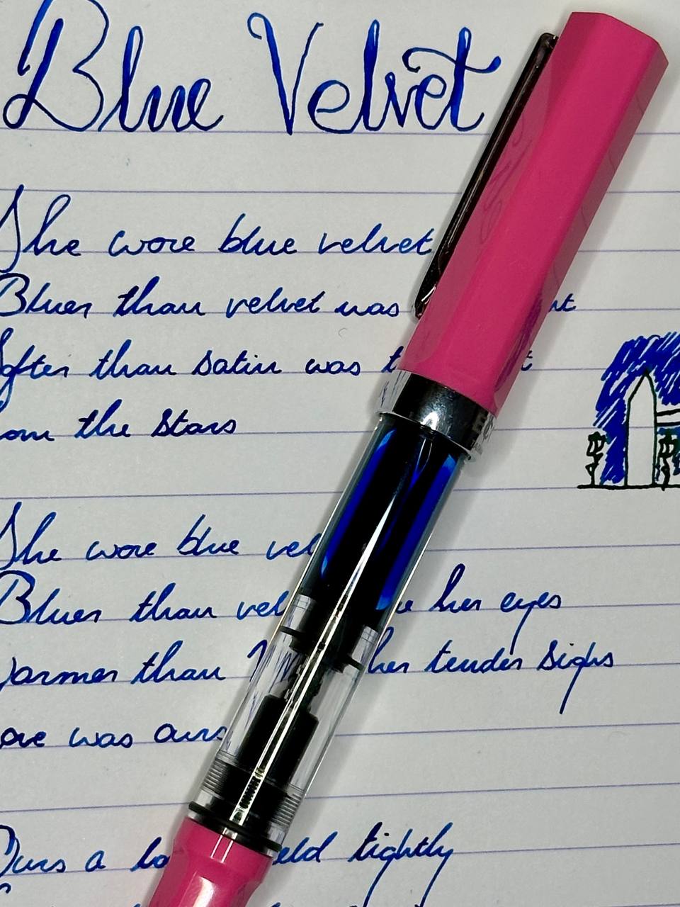
Blue and pink is my favourite colour combination, which made my pink TWSBI Eco the obvious choice for this ink
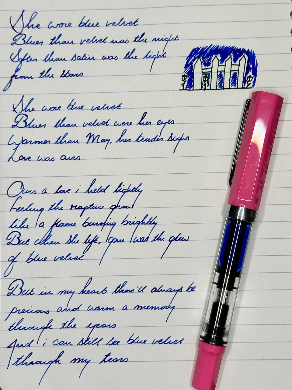
I own four Ecos (white, two blues, and this pink). They’re easy to recommend; reliable, affordable, available in a stupid number of colours. The piston filling system is satisfying. They just work
Also, the Eco model is a demonstrator pen, meaning I really got that blue/pink combination I was hankering for; the ink is on display even when it’s not on the page
But this particular Eco has a secret
(No; it isn’t a peeping Tom who likes to watch you from inside your closet)
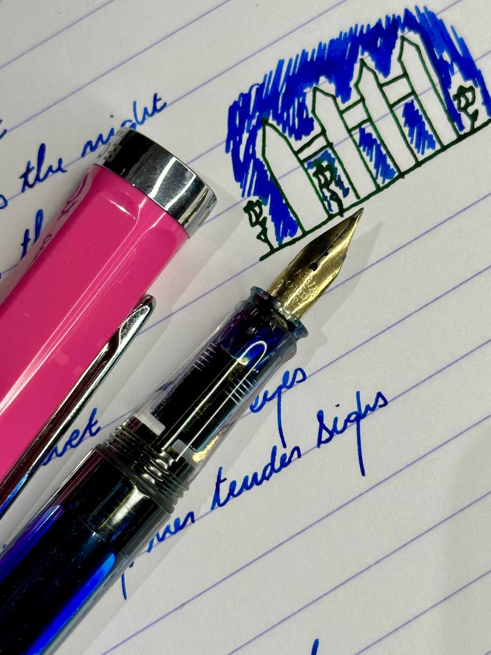
I shoehorned a vintage Mabie Todd No. 2 Swan flex nib in there many moons ago, and it has no business working as well as it does
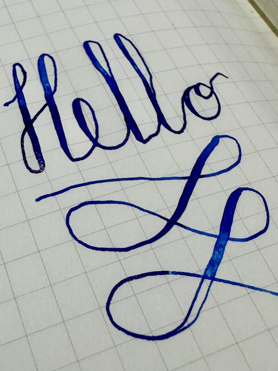
So when I really want to show the ink off? Just press harder! The flex nib lets the ink pool on the page; a serene blue that looks good enough to drink
(Please don’t)
The Ear in the Field
Er..
But here’s the thing about that nib hack
I broke it. Once on purpose, the other by accident
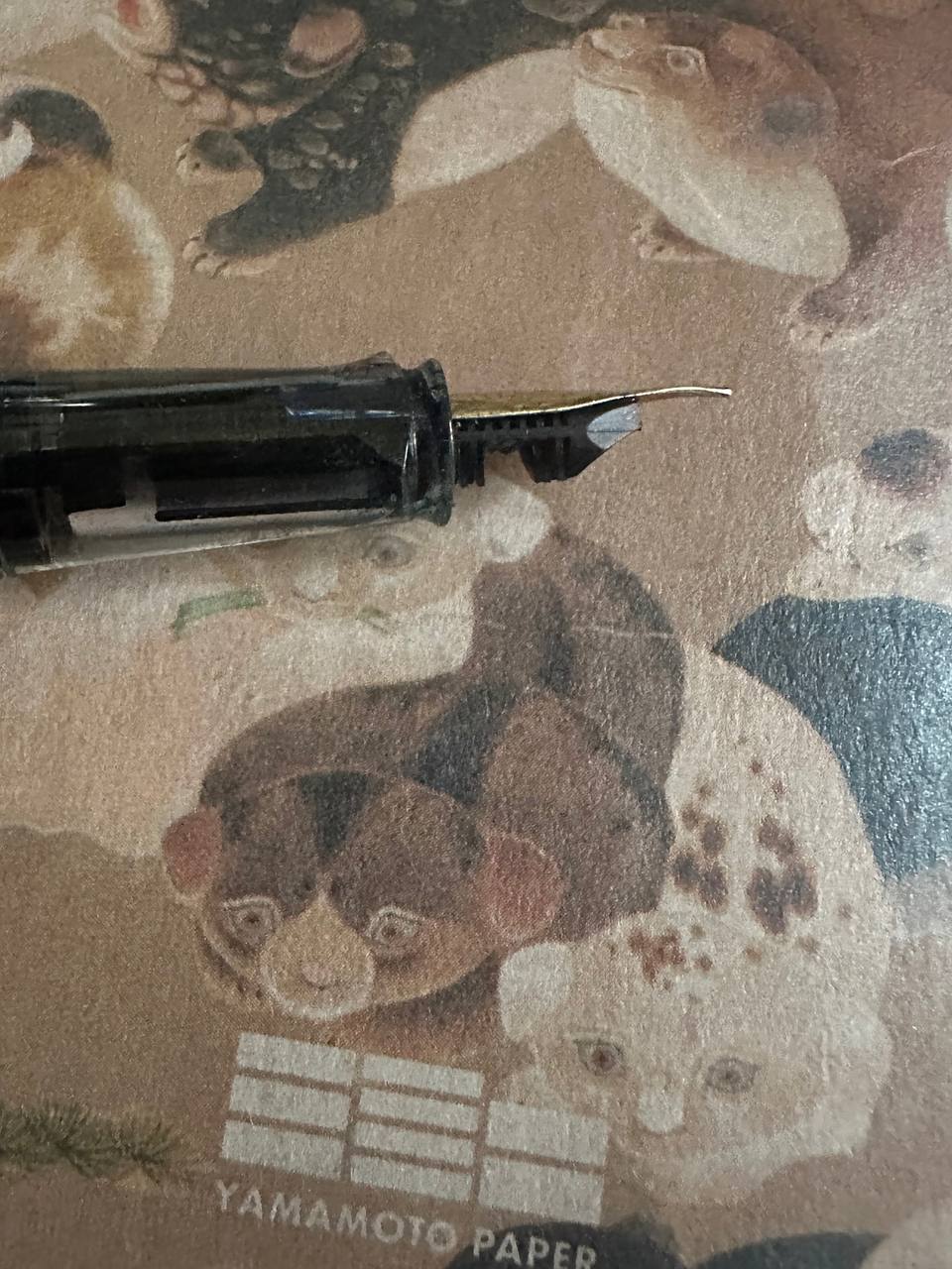
The purposeful breaking was mandatory; the Mabie Todd No. 2 nib wouldn’t sit in the TWSBI feed and provide enough flex, as the feed came too far up the nib and it would choke the flow. So I had to cut it down, meaning it’s not pointed at the top, but abruptly square at the end
The accidental breakage thankfully hasn’t resulted in any poor performance. When rejigging the nib around not soon after the initial hack (still trying to get the optimal flow) I pushed the feed too far into the section. The only way I could get it back out was to pull with so much force that I snapped some of the fins in the process
It took a few attempts to get this pen to work with this nib, and honestly, I don’t recommend trying this at home because it seems like it isn’t the easiest of all pen-mods
Regardless, this pen holds up incredibly well with flex writing and, in the end, the sacrifices, cursing, and cut thumbs (and feeds) were all worth it
It’s not a flawless vintage writing experience, but honestly, I’d say it’s about 95% the way there. There’s some insane line variation to be had in this nib, which is already pretty damn impressive; there will be times where it railroads and you need to prime the feed if you really want to go insane with it, but if you’re a bit more modest with your expectations then it works as you’d expect
I’m a left-handed overwriter; lefty writing doesn’t lend itself to flex work anyway. I’ll flex for my signature, for headings in my planners, that sort of thing. Never full sentences.
So no love lost, really
There’s something underneath the surface of this pen. Something that looks broken, but works anyway. Something unsettling and gorgeous in equal measure
Lynch would approve (RIP)