
A Soviet, An American, and a Japanese Walk into a Pen Case
The three pens I have inked up for the upcoming fortnight are all pens that I bought while I was studying my undergraduate degree.
Two of these pens represent a somewhat bipolar world order. The first, a Soyuz fountain pen that was made in the Soviet union, and of which bears a striking golden resemblance to a pen by a famous German manufacturer. The other pen is perhaps one of the most iconic and famous American pens of the 20th century.
The third and final pen I have in my arsenal (thankfully not a nuclear one) is a Japanese pen that has a juuuiiicy wet nib with pencil-like feedback made by Sailor.
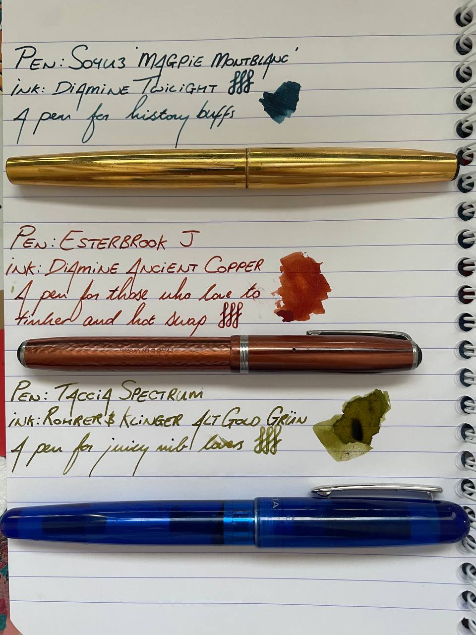
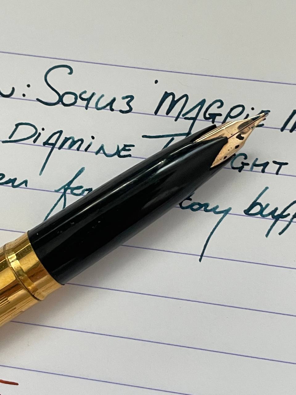
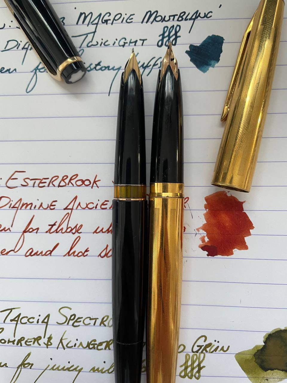
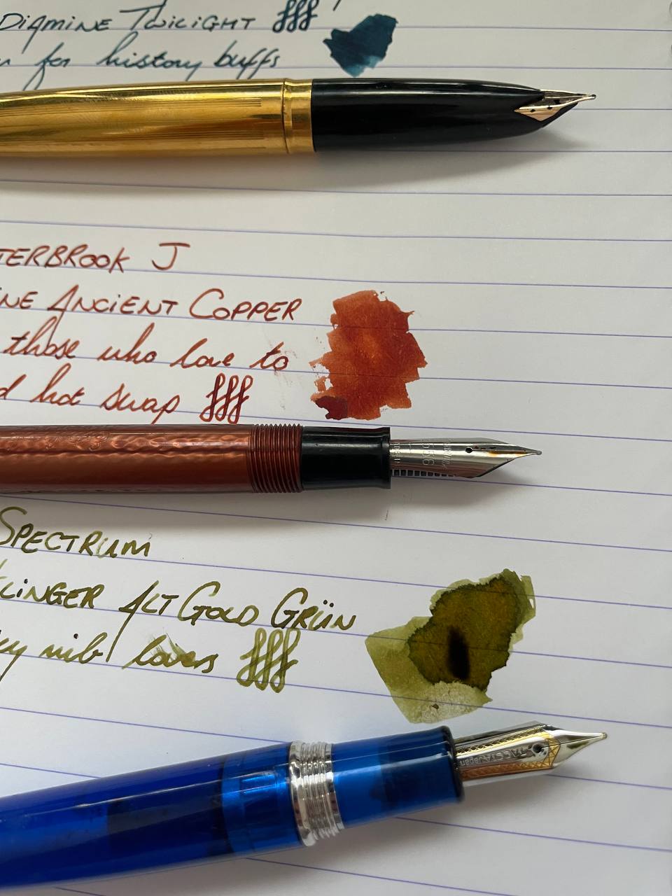
Soyuz Magpie Montblanc
Specifications:
- Filling System: Captured converter
- Nib: Medium (I guess)
- Price Range: Depends
- Ink: Diamine Twilight
My undergraduate degree was in Politics, Philosophy, and Economics. During my time at university I took three modules that had some sort of focus on Russia and/or the Soviet Union, and while I came to learn a lot about the political, philosophical, and economical aspects of that region throughout time, I found my pen knowledge lacking.
So I hopped online and sought to change that.
There is some information out there about vintage Russian/Soviet fountain pens, and of course there are modern Russian manufacturers such as Benu (although I am aware that they have since moved their operations). The company that appeared the most in a vintage sense seemed to be a brand called Soyuz.
From my surface level research, Soyuz made pens that would commemorate certain space missions, and would often wear bright metallic colours on their barrels. The one I have is gold, but I have seen pictures of this same model, but in silver.
This pen has fine lines that run down the barrel. They’re not large or deep enough to give a proper texture, but you can definitely feel them when you run your fingers over them. Equally, from a distance, you can’t see them too well (and the shininess of the gold probably doesn’t help with this), but when you look close up, it does give a refined look to the pen.
The nib is where this pen gets really interesting. As I alluded to above, the design of this pen seems to take inspiration from a certain German pen manufacturer and looks very similar to the Montblanc 22. Except, with its metallic shine, probably marketed towards magpies.
So there. I will now refer to this pen in my collection as the Magpie Montblanc, unless someone is able to give me the correct model name. This, however, I fear is perhaps lost to history.
The nib is wet and juicy. I don’t think it’s gold, but there is some flex to it. While it might be down to my writing angle as a left-handed–over-writer, I get a really smooth down stroke, but a subtle feedback whenever the pen rests itself on the left tine. It’s rather nice!
The pen fills with a captured-converter. There is no removing this thing, and even if you did, the barrel would no longer connect to the grip section because the threads are on the converter.
Who this pen is for: History buffs
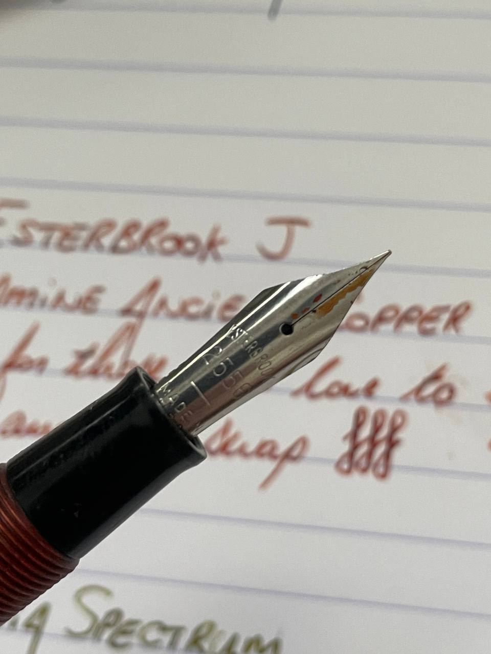
Esterbrook J
Specifications:
- Filling System: Lever-fill
- Nib: Firm Fine / 2556
- Price Range: Depends
- Ink: Diamine Ancient Copper
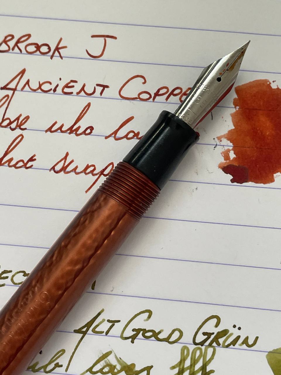
The Esterbrook J is perhaps one of the most famous vintage pens out there, maybe only rivalled by the Parker Vacumatic or 51 pens.
It is a celluloid pen that was manufactured around the mid-20th century and was revolutionary due to its screw-in renew point nibs, which makes it super easy to hot-swap nibs into the barrel. Esterbrook provided nib options like your typical extra fine to broad sizes, varying rigidity/flex, and specialised nibs for things like accounting and shorthand.
Apparently there were over 100 different nib options!
The nib I have in this pen is marked 2556, which is up there as one of the most common nibs and is a firm fine. The [2] prefix indicates that it is one of the regular use nibs as part of their Master Series (aka 2000 Series), which designates it as a steel nib with higher quality than the more economical 1000 Series.
Within each series, the second digit indicates the general nib type, with [5] characterising it as a general writing nib.
I haven’t inked this pen up for a very long time (it appears I was very diligent cleaning it last time - thankfully!) and after researching this pen and all the different nibs, I think I will be trying to pick up some more of these in the future. Whether different nibs or an entire new pen body to see if I could collect some more colourways.
This terracotta colour is absolutely gorgeous though!
My only gripe with this pen is that I find it a touch too small to use unposted, but too large to use posted. Not that I’m much of a fan of capping my pen anyway. It’s only lacking by a very minute scale; if it was about 1-2cm longer then it would be perfect.
Who this pen is for: Those who love to tinker and personalise their pens
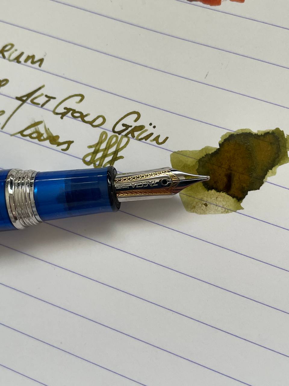
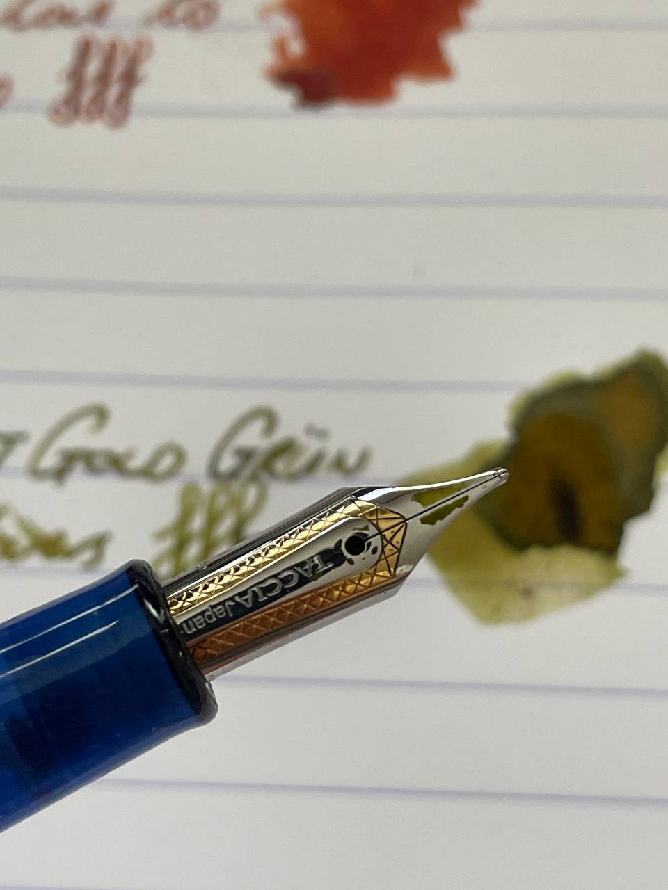
Taccia Spectrum
Specifications:
- Filling System: Converter
- Nib: Broad
- Price Range: Unsure
- Ink: Rohrer & Klinger Alt Gold Grun
Man, I could think of so many horrible words / terms to describe this ink.
Despite green and yellow being perhaps my two least favourite colours, I really like this baby-poo green-yellow.
The nib shows the colour off brilliantly. It is a very wet broad nib and it is a pleasure to see the ink being laid onto the page while writing. You can see the flow of the capillary action on the paper - a rich and dark pooling that gently lightens up as it settles.
What I also really enjoy about using this pen is that the feedback as a gorgeous pencil-like characteristic to it.
I had a bit of an accident when inking this pen up. Because Taccia nibs are manufactured by Sailor, and the converter looked as though it was a Sailor proprietary fit, I thought I could use this in my Sailor Pro Gear (makes sense, right?)
I’ve unfortunately misplaced my Sailor converter and I’ve been wanting to ink the Pro Gear up for a while. When I put it in the Sailor, the converter held for a while… right up until the moment I put it into the bottle of ink… Plop!
The nib unit fell into the ink and I had to fish it out with my fingers, which was as finicky as it was messy.
If only this happened with a bright blue or pretty pink shimmer. Alas. I like the ink, but not enough to wear it on my fingers.
Conclusion
This fortnight’s trio represents more than just writing instruments — they’re a journey through history and craftsmanship spanning three continents.
From the enigmatic Soviet Soyuz “Magpie Montblanc” with its intriguing resemblance to German luxury, to the quintessentially American Esterbrook J with its innovative hot-swappable nibs, and finally to the Japanese Taccia Spectrum with its Sailor-made nib delivering that distinctive pencil-like feedback.
Each pen carries its own story—tales of cold war manufacturing, mid-century American innovation, and Japanese precision. And each delivers a unique writing experience, from the subtle flex of the Soyuz to the firm reliability of the Esterbrook to the juicy wetness of the Taccia.
What quirky historical pens do you have in your collection?
Let me know at any of the following: